Snippets
text center
<div class="text-center">
  <h1>Welcome</h1>
</div>
Design
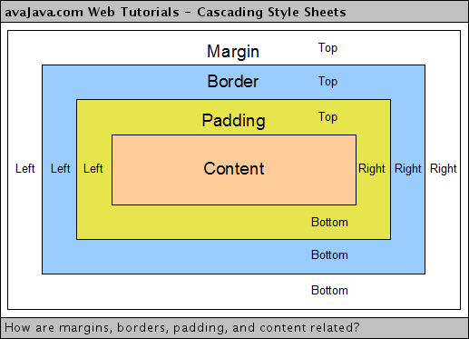
Margin & padding

Flex
Fonts
- Google Fonts
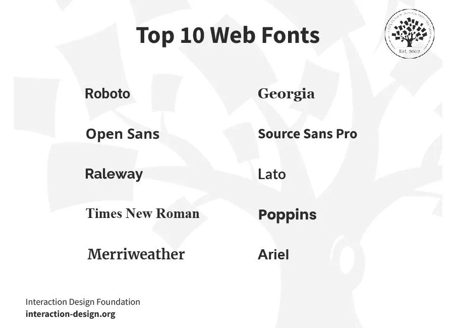
- Top 10 Web Fonts
-
Serif
- Georgia
- Times New Roman
- Merriweather
-
Sans-Serif
- Roboto
- Open Sans
- Source Sans Pro
- Lato
- Raleway
- Poppins
- Ariel
-

Color
Color Harmonies
- Complementary colors: Colors that are directly opposite one another on the color wheel are known as complementary colors. Complementary colors have a high contrast and can be very effective as accent colors when paired with a more neutral palette.
- Triadic colors: Triadic harmonies consist of three colors equidistant from one another on the color wheel. Like complementary colors, triadic schemes tend to be very bright with a high contrast and work best when one color dominates.
- Tetradic colors: Tetradic color harmonies are formed by two sets of complementary colors 60 degrees apart on the color wheel. Tetradic schemes are an excellent starting point for creating color palettes; fine tune them using color shades, tints and tones.
- Analogous colors: Analogous harmonies are created by selecting the colors directly adjacent to a chosen color. Frequently found in web design, analogous schemes, when paired with a complementary color for contrast, can offer great versatility.
- Neutral colors: Neutral schemes, like analogous harmonies, are formed by taking the colors on either side of a chosen color but at half the distance. While analogous schemes typically use colors 30 degrees apart, neutral harmonies use colors 15 degrees apart.
Color Shades
Adding black in varying levels to a color produces gradually darker variants, or ‘shades’, of that particular color. Shades work well for link hover effects, or as footer and header backgrounds.
Color Tints
Color tints are made by adding white to a color, resulting in increasingly lighter versions. Tints can also be used for CSS hover effects, and perform nicely as modal backgrounds.
Color Tones
Tones are created by adding gray to a color, and produces an almost endless variety of colors depending on what level of gray is used. Less common in web design, tones could be useful for typographic elements like comments, quotes or highlights.
Resources
- Vuetify - Colors
- HTML Color Names/HTML Color Picker
- Generators
Icons
<v-icon color="info" icon="mdi-alert" size="large"></v-icon>
Logo
Vuetify
Init
npm create vuetify@latest
Theme
修改 src/plugins/vuetify.js
import { createApp } from 'vue'
import { createVuetify } from 'vuetify'

const myCustomLightTheme = {
  dark: false,
  colors: {
    background: '#FFFFFF',
    surface: '#FFFFFF',
    'surface-bright': '#FFFFFF',
    'surface-light': '#EEEEEE',
    'surface-variant': '#424242',
    'on-surface-variant': '#EEEEEE',
    primary: '#1867C0',
    'primary-darken-1': '#1F5592',
    secondary: '#48A9A6',
    'secondary-darken-1': '#018786',
    error: '#B00020',
    info: '#2196F3',
    success: '#4CAF50',
    warning: '#FB8C00',
  },
  variables: {
    'border-color': '#000000',
    'border-opacity': 0.12,
    'high-emphasis-opacity': 0.87,
    'medium-emphasis-opacity': 0.60,
    'disabled-opacity': 0.38,
    'idle-opacity': 0.04,
    'hover-opacity': 0.04,
    'focus-opacity': 0.12,
    'selected-opacity': 0.08,
    'activated-opacity': 0.12,
    'pressed-opacity': 0.12,
    'dragged-opacity': 0.08,
    'theme-kbd': '#212529',
    'theme-on-kbd': '#FFFFFF',
    'theme-code': '#F5F5F5',
    'theme-on-code': '#000000',
  }
}

export default createVuetify({
  theme: {
    defaultTheme: 'myCustomLightTheme',
    themes: {
      myCustomLightTheme,
    },
  },
  defaults: {
    VBtn: {
      color: "primary",
      rounded: "md",
      flat: true,
      fontWeight: "400",
      letterSpacing: "0",
    },
    VCard: {
      flat: true,
      elevation: 10,
    },
  },
})
Font
add to src/styles/settings.scss
@use 'vuetify/settings' with (
  $body-font-family: "Lato"
);
@import url("https://fonts.googleapis.com/css?family=Lato:400,500,700,900&display=swap");
Tailwind
TailwindCSS - Install Tailwind CSS with Vue 3 and Vite
Install
- 创建一个 vue 项目
pnpm create vite@latest
cd my-project
pnpm install
- 安装 Tailwind CSS
pnpm install -D tailwindcss@latest postcss@latest autoprefixer@latest
- 创建配置文件
tailwind.config.js和postcss.config.js
npx tailwindcss init -p
- 修改 tailwind 配置
// tailwind.config.js
module.exports = {
  purge: ['./index.html', './src/**/*.{vue,js,ts,jsx,tsx}'],
  darkMode: false, // or 'media' or 'class'
  theme: {
    extend: {},
  },
  variants: {
    extend: {},
  },
  plugins: [],
}
- 修改
index.css和main.js导入 Tailwind
/* src/index.css */
@tailwind base;
@tailwind components;
@tailwind utilities;

/* VSCode 不识别可以改成 */
@import "tailwindcss/base";
@import "tailwindcss/components";
@import "tailwindcss/utilities";
// src/main.js
import { createApp } from 'vue'
import App from './App.vue'
import './index.css'

createApp(App).mount('#app')